elhacker.net cabecera Bienvenido(a), Visitante. Por favor Ingresar o Registrarse
¿Perdiste tu email de activación?.


Tema destacado:


  Mostrar Temas
Páginas: 1 2 [3] 4 5 6 7 8
21  Media / Diseño Gráfico / Fractalius [Filtro para photoshop] en: 16 Diciembre 2010, 07:57 am
Existen una inmensidad de filtros , plug.ins , entre otros para photoshop , algunos son gratuitos , algunos de pago. En realidad nunca me habia animado a usar uno , hasta que hace unas semanas vi este filtro bastante interesante y pense... tal ves no es mala idea probar... y bueno..la verdad que da un terminado bastante interesante a las fotos , todo depende de como lo usemos obviamente ;D


Cambio bastante interesante en la foto...les dejo el link de descarga del filtro en los comentarios del archivo estan las instrucciones (no son muchas , solo descomprimir en una ruta especifica y nada mas)
http://rapidshare.com/files/437233732/fo-rf103.rar
Una ves descomprimo en la ruta donde la necesitamos , solo abrimos el photoshop , abrimos nuestra imagennos vamos aFiltro > Readfile > FractaliusY nos aparece este cuadro de configuracion del filtro , donde podemos jugar con los valores para ir obteniendo distintos resultados

El filtro necesita por lo menos de una resolucion de pantalla minimo de 1024 x 768 , aunque con menos resolucion tambien se puede usar , pero es mas complicado cambiar algunos valores o llegar a usar el "random " que trae incorporado....No es muy dificil de usar , ni tampoco son muchos pasos como para perderse en el uso del mismo , asi que eso es todo
Saludos
22  Media / Diseño Gráfico / Creando texto con estilo de nubes en: 28 Noviembre 2010, 09:07 am
No quiero extenderme demasiado...
Primero abrimos un nuevo documento , las medidas que nosotros queramos , aunque creo que va a tener que ser de 1024 x 768 como minimo , por si tenemos problemas con el pincel
Bueno una ves teniendo nuestro documento , vamos a ponerle el background de algun color (no importa cual , mientras no sea blanco)
Seleccionamos la herramienta pincel (tecla B) y seguidamente presionamos F5 donde nos va a aparecer una ventana , donde en el primero paso vamos a seleccionar estas opciones...


Seguimos configurando nuestro brush con las siguientes caracteristicas...


Una ves configurado nuestro pincel , vamos a crear el texto , o lo podemos hacer antes de configurar nuestro pincel , ustedes verán que les queda mas cómodo , aunque si siguen el tutorial paso por paso van a tener que hacer esto xD


Se puede ver la fuente utilizada y el tamaño de la correspondiente.

Ahora vamos a crear una nueva capa , y seleccionar la herramienta Pluma (tecla P)

Y vamos a crear el trazado de la primera letra (fui creando letra por letra por si salia mal ustedes verán si quieren probar todas juntas..)


Ahora , con la pluma seleccionada , hacemos click derecho y vamos a la opción "contornear trazado"

sin activar la opción Presionar Pluma... y le damos a OK


Ahora como esa parte de la letra D , era mas ancha ,necesitaba mas "cuerpo" , pero las otras partes son mas chicas , por lo cual ahora voy a reducir un poco el pincel


Pueden ver que para la otra parte de la letra D , cree otra capa , por si el resultado no es el deseado y poder corregirlo sin tener que eliminar la parte donde ya lo tengo hecho bien


Ahora otra ves voy a usar la opción de la pluma "contornear trazado" solo que esta ves la use 2 veces.

Una con la opción Contornear trazado , y otra , sin esa opción ...

Dejándome este resultado


Hasta hay vamos bien , ahora solo falta aplicarle un desenfoque gaussiano para darle un toque mas real según mi perspectiva ;D


Bien , ahora después de darle el desenfoque , solo faltaría hacer lo mismo con las demás letras 


Como ven hice cada letra por separado , y ordenándolas en grupos para mayor comodidad

Una ves terminado esto ya tenemos nuestro texto 

podemos agregarle un avioncito y esas cosas quedan para la imaginación de cada uno


Dudas, criticas , comentarios o consejos como siempre son aceptados

this is it...
23  Media / Diseño Gráfico / ayuda buscando post :P en: 4 Octubre 2010, 23:11 pm
alguno se acuerda que una ves alguien posteo un link con 800 mb de brushes en una solo link ?
lo estuve buscando pero no lo encuentro :/
alguna sabe mas o menos como se llamaba el topic o el creador por lo menos ?
estuve buscando en las paginas , en google y no sale nada -.-"
en la recopilacion y otros y no la encuentro -.-"
24  Sistemas Operativos / Windows / Disco detectado , pero no se tiene acceso ? en: 27 Septiembre 2010, 04:49 am
Tengo un problema con el disco que mencione hace unos dias
inicie con un live cd de ubuntu , y no detecta el disco
la bios reconoce el disco , pero cuando lo pongo como esclavo en un disco donde tengo instalado windows , tambien es detectado por el sistema , pero al querer acceder dice que no se puede
no puedo acceder ni por ms-dos , explorando discos ni de live cd como ya dije
al mirar el espacio en el disco , sale "0 bytes"

segun yo , el disco murio :/
segun ustedes ?

el disco IDE  tiene mas o menos 3 años de vida y esta todo en perfecto estado lo demas , lo probe con 2 maquinas distintas
x si alguno necesita mas info :3

saludos
25  Sistemas Operativos / Windows / pantallazo azul , no inicia win en: 24 Septiembre 2010, 20:00 pm
tengo un poiblema
me sale un pantallazo azul , seguramente mal funcionamiento del sistema o algo corrupoto que se io
el tema es que no inicia ni en modo seguro -.-"
como ven no puedo iniciar windows , alguna sugerencia de como arreglarlo '?
no quiero formatear , es mucha perdida de tiempo
y tampoco tengo datos precisos del error , por que se reinicia sin dejar leerlo -.-"

algo? xD
saludos
26  Foros Generales / Dudas Generales / evadir https ? en: 30 Agosto 2010, 09:02 am
Buenas..
resulta que este mes no pude pagar la cuenta de internet :B
pero mi isp todavía manda digitalizacion al router y linea telefonica , el tema es que usando un proxy puedo conectarme a internet , no puedo usar messenger ni tampoco usar conexiones con https , por ejemplo faceboook o twitter ya que la pagina principal esta en http , pero el login esta en https
a eso es lo que voy habra alguna especie de proxy o algo por el estilo para poder navegar con https o evadirlo a lo mucho
estoy medio desorientado en este tema :/
27  Media / Diseño Gráfico / crear frutas cuadradas con Photoshop en: 28 Julio 2010, 18:28 pm
Primer Paso:
Obtener los recursos para realizar el tutorial, en este caso una fotografía de una naranja y una naranja cortada a la mitad. Separarlas en formato PSD, borrando los fondos.

Segundo Paso:
Abrir un nuevo documento en blanco y arrastrar la fotografía de la naranja completa y le colocamos a la capa el nombre Naranja. Luego creamos otra capa y presionamos en la barra de herramientas, la herramienta línea (U), hacemos clic en las opciones de la parte superior en Rellenar Pixeles y en Grosor colocamos 20px; y dibujamos un cubo alrededor de la naranja

Tercer Paso:
Estando en la capa Naranja, presionamos Filtro > Licuar (Mayús+Ctrl+X).
En la ventana emergente de Filtro > Licual, presionamos HERRAMIENTA DEFORMAR HACIA ADELANTE, primer icono de la barra de herramientas de la izquierda.
En la parte inferior derecha de la misma ventana activamos la casilla Mostrar Telón de Fondo y seleccionamos en USAR la capa Naranja.
El objetivo de activar Mostrar Telón de fondo, es que nos permitirá observar el cubo de estructura lineal que hicimos, con este fondo activado, procedemos a ir empujando poco a poco la piel de la Naranja hacia los costados teniendo como guía las líneas del cubo.

Cuarto Paso:
Sin salir de la ventana Licuar, presionamos el icono de la herramienta INFLAR y vamos haciendo clic a lo largo de las esquinas superiores del cubo, dando la apariencia curva en las esquinas.

Quinto Paso:
Sin salir de la ventana Licuar, presionamos el icono de la herramienta DESINFLAR y vamos haciendo clic en los lados lateriales del cubo, esto nos permitirá dar la apariencia de plano en los costados

El resultado deberá ser algo parecido a la siguiente imagen

Finalmente presionamos OK y salimos de la ventana LICUAR.
Sexto Paso:
A continuación creamos una Capa y la llamos LUCES y seleccionamos la herramienta PINCEL con un grosor de creamos conveniente, realizamos los brillos de las esquinas del cubo.
También añadimos el detalle de la parte superior de la Naranja y le colocamos la respectiva sombra.

Septimo Paso:
Ahora nos falta colocar el detalle del corte. Abrimos el documento de la fotografía de la Naranja partida a la mitad y la seleccionamos, presionamos CTRL + C y regresamos al documentos de nuestra Naranja cuadrada.
En este documento realizamos con la Herramienta Lazo una selección en la Naranja completa que simulara al Corte y pegamos dentro de esta selección la imagen de la mitad de la Naranja, para hacer esto, presionamos MAYÚS + CTRL + V.

A continuación presionamos CTRL + T y procedemos a escalar y distorsionar la imagen de la mitad de la naranja, hasta adaptarla a la pesrpectiva.
Luego dejamos un marco blanco alrededor de la pulpa, que corresponde a la parte carnosa de la Naranja y clonamos la pulpa hasta conseguir una forma cuadrada.
Finalmente jugamos con la herramienta SUBEXPONER y damos las sombras correspondientes.
Para terminar damos un toque de luz con FILTRO > INTERPRETAR > EFECTOS DE ILUMINACIÓN.
Resultado FINAL

Con una Manzana:


fuente:
http://www.utilidades-gratis.com.ar/tutorial-para-crear-frutas-cuadradas-con-photoshop/
28  Programación / Programación C/C++ / quitar espacios en cadena ? en: 26 Julio 2010, 20:01 pm
tengo una duda :P
como puedo quitar el caracter ' ' de una cadena , suponiendo que la cadena la tome con gets(cadena);

digamos que a "hola como estas"
deberia quedarme como "holacomoestas"

alguna sugerencia :/ ?
yo no entiendo como hacerlo :/
gracias
saludos

pd: ahh en C , no en c++ ;P

29  Media / Diseño Gráfico / Smashing Your Creative Block – Photoshop Tutorial en: 24 Julio 2010, 08:38 am
The question arises so much nowadays, How do you overcome your Creative Block? I made it simple for everyone today and created a Photoshop Tutorial to smash your creative block. I will use simple and easy techniques to create a smashing composition text tutorial. It won’t take you to long to finish and you will learn that it is pretty easy to create this effect. Have fun.
Artist: Jacques van Heerden / An1kenOccupation: Digital ArtistPortfolio: An1kenBlog: Creativeoverflow

Final Preview:


Tutorial Requirements:
Time: 45minsDifficulty: BeginnerStocks: Smashed Glass – I have no Idea where I got the Smashed Glass Texture from, anyone to help?Texture: 24 High-Res Concrete Textures

Introduction:
Today we will creating a Text Effect Tutorial. In this Tutorial we will be smashing the Creative Block into pieces, Literally. I will be teaching you how to use the simple tools of photoshop to your advantage and create a striking text effect. We will be breaking apart the text with simple methods and bring across a message to everyone.
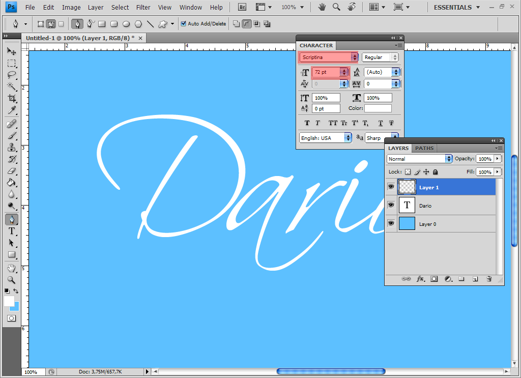
Step 1:
Open up photoshop and create a new canvas with the sizes 1500 x 720px and fill it with Black #000000. Once you have that set up, grab your text tool (T) and choose a nice bold font. In this case I used MyriadBold, at a size of 70pt and Filled White #FFFFFF. I centered the text on the canvas and then rasterized the layer. To Rasterize make sure your text layer is selected and then go to Layer>Rasterize>Type – this will turn your text layer into a flat layer, ready for editing. Name the layer Creative. You should have something like this below.


Step 2:
Now that you have your Type setup on the canvas and your layer Rasterized. Its time to get editing. Grab your pen tool – make sure at the top that you have Paths option selected, we don’t want to work with Shape Layers in this tutorial. Make sure your Creative layer is selected, now use your pen tool and draw a line around the middle part of the C, then when you have closed your path make sure you right click and hit Make Selection, Make sure you choose 0 Radius when the box comes up – just hit OK. Then go to Edit>Cut (CTRL + X) Now go to Edit>Paste (CTRL + V) this should paste half the C into a new layer. By using the Move Tool (V) you are able to move the half C around and position it as you like. This is my outcome.
Pen Tool:

Outcome:


Step 3:
In this step I will show you have I made the R stretch up like that. Firstly Duplicate your Creative Layer by selecting the layer and going to Layer>Duplicate layer… Now hide that layer by clicking the Little Eye Icon next the the layer name on the left hand side. Now create a new layer below your Creative copy layer and grab your pen tool. Now create a Sharp Triangle Shape over the R and then fill it with Black #000000, be sure that you filled the layer in the New Layer you created below the Creative Copy Layer.

Now that you have your black filled shape covering your R unhide the Creative copy layer above it and then right click the layer and select Create Clipping Mask (CTRL + ALT + G). You shouldn’t see a change just yet, but grab your move tool (V) and move the Creative copy Layer down a bit, you will see it influences the feel of the R. Move the layer to a position that you are happy with.


Step 4:
Now that we have our R sorted out its time to move onto the next letters. Using the Same techniques as earlier let’s shift and delete and play around with the EATIVE text. A brief run through the steps are Make sure your Creative Layer is selected and grab your Pen tool, select the part of the letter you want to move and then Cut it, Edit>Cut (CTRL+X) and then Paste it Edit>Paste (CTRL+V) and then use the Move Tool (V) to shift the shapes around. I will give you some time now to run through the letters, I will show you the progress of my letters below.
E:

A:

T:

I:

V:

E:


Step 5:
Now that your Creative word is totaly sliced up and moved around its time to bring in our second word. “Block” Grab your type tool and Type BLOCK with the same font and a size of 40pt filled white #FFFFFF. Rasterize the layer by going to Layer>Rasterize>Type or Right Click>Rasterize. Now your word is setup and ready to go. Their is nothing fancy about cutting up the word block in this tutorial, play around and use your imagination. Select the parts and cut and paste them and move them around to create a sliced feel of the word. This was my outcome after I sliced up the word Block as well.


Step 6:
Now we are past the hard part of the tutorial. Now we are going to use stock images to just spice up the piece a bit. Firstly get yourself a nice concrete texture, I used one out of my 24 High-Res Concrete Texturesavailable here on Creativeoverflow. I placed the concrete texture above all my other layers and then set the Blending Mode to Darken. Now, this might take some concentration, you have to Hold down CTRL + SHIFT and click each individual Layer’s Tiny Window. This will highlight the Layer with the selection tool. Go down your layers list and be sure to select all of them. This is what your selected items should look like with the texture on top.

Now go to your Texture layer and select it by just clicking on it and then select the Add Vector Mask button on your layers pallett, its right next the the FX button at the bottom. Another alternative is to go to Layer>Vector Mask>Hide all and then use your brush with white to fill the highlighted areas.


Step 7:
I know that the piece doesn’t look very attractive at the moment, but we will change that. Go to your Textured layer and select your Burn Tool (O). Set the exposure to 50% and choose a medium sized soft brush. Burn the edges of the Letters to create a contrasting effect. I have pointed them out to you in the preview below.


Step 8:
Now go to Layer>New Adjustment Layer>Brightness and Contrast – Set the Brightness to +14 and the Contrast to +100. This should add some depth to your Lettering, but not enough. We are going to a layer style to the sliced pieces. Double click on one of the sliced pieces and choose a Drop Shadow and. Use the settings below. then hit OK.

Now right click on your layer that you just adding the Layer Style to and select Copy Layer Style. Now Select all the Sliced Layers, excluding your two word layers (Creative and Block), Your R layer and Textured Layer. You can select them by holding down CTRL and clicking on each layers name. Once you have them all selected right click on anyone of them and select Paste Layer Style. This should add a large amount of depth and diversity to your letters.


Step 9:
Now create a new layer by going to Layer>New>Layer (CTRL+SHIFT+N) and then fill it with Black #000000 now set the blending mode of the layer to Color Dodge and select your brush tool. Use a fairly large soft brush with striking colors, example orange, Green, Pink, Blue. I used Green and orange and vaguely touched the edges of the Text. Next I created another New Layer and filled it with Black #000000, I set the Blending Mode to Overlay and grabbed my Brush tool with the same soft brush and just selected White #FFFFFF as my foreground color. I brushed on the lettering to bring out some light and highlights in the text.


Step 10:
Our final step for this tutorial is pretty basic, we use the Smashed Glass image and import it into our Composition. We set the blending mode of the layer to Linear Dodge and we erase some of the parts that we don’t want. Now you are done with the tutorial. Hopefully you have smashed your creative block into pieces. You are more than welcome to add on your own bits and pieces, but I hope you enjoyed the tutorial.

Version traducida al español por google traductor:
http://translate.google.com.uy/translate?js=y&prev=_t&hl=es&ie=UTF-8&layout=1&eotf=1&u=http://creativeoverflow.net/smashing-your-creative-block-photoshop-tutorial/&sl=en&tl=es
saludos
30  Programación / Desarrollo Web / extraer codigo fuente de un iframe ? en: 22 Julio 2010, 20:33 pm
buenas... saben tengo una duda , va no se si se podra , pero me facilitaria mucho el trabajo si se pudiera hacer lo siguiente

supongamos que tengo un index  y dentro de el un iframe hacia otra pagina...
lo que yo quisiera ver , si es posible extraer el contenido o codigo fuente del iframe

yo estuve pensando pero no se me ocurre nada todavía , o no doy con el clavo ?¿

alguna sugerencia o link para leer y tener algo mas en claro ?
gracias
saludos
Páginas: 1 2 [3] 4 5 6 7 8
WAP2 - Aviso Legal - Powered by SMF 1.1.21 | SMF © 2006-2008, Simple Machines